
The choice of a dashboard over other forms of data presentation lies in its ability to offer a quick and effective visualization of key information. Dashboards condense complex data into easily understandable charts and widgets, enabling users to identify patterns, trends, and anomalies immediately. Visualizing these elements along a 'narrative journey' in the dashboard, from identifying a problem to presenting potential solutions, helps make sense of the data and emotionally engage the audience in the story the data is telling.
Unlike extensive reports, dashboards provide a panoramic view and allow for more agile decision-making. By narrating the story behind the data through the dashboard, a cohesive thread is created, making it easier for users to follow the plot and understand the importance of each visual element.
The link between a dashboard and a business report is crucial. While a dashboard offers a quick view of the data, a detailed report provides context, deeper analysis, and explanations. This combination builds a complete narrative supporting informed decision-making, providing a logical and emotional connection between the presented data and the strategic decisions that need to be made.
A good dashboard is like a good friend: it tells you what you need to know, when you need to know it, and in a way that's easy to understand.
Insights from exploratory data analysis fuel both dashboards and reports, ensuring that the visual presentation is backed by a comprehensive understanding of the underlying data. Actions resulting from these insights can be communicated and documented in reports, creating a continuous cycle of data-driven improvement. Together, dashboards and reports work synergistically to tell a compelling story that facilitates informed strategic decisions.
This is why dashboards have the potential to revolutionize the management and understanding of business data by facilitating the transformation of initially complex datasets. This transformation provides a comprehensive and clear view of business performance and its operations.
Despite the expectation that dashboards offer clients a quick view of key performance indicators to improve their businesses, their effectiveness can be compromised for various reasons. Among them, design errors stand out as one of the most common reasons, significantly impacting the dashboard's effectiveness and users' ability to comprehend and make informed decisions based on the data.
Designing without a clear objective
Designing a dashboard without a defined goal can be overwhelming and lacking focus. Before starting the design, it is crucial to identify the purpose of the dashboard and the objectives it must fulfill.
There is a very common confusion between goal, metric, and Key Performance Indicator (KPI). | These are interconnected concepts but not synonymous.
- Business Objective: It is the definition of the achievement sought as the final goal, usually established by the client, such as increasing sales, for example. This objective tends to be abstract and general. To establish objectives, the SMART methodology is used, which defines that these must be Specific, Measurable, Achievable, Realistic, and Time-bound.
- Metric: It is a unit, expressed in absolute numbers or percentages, such as clicks on a banner. Metrics are not objectives in themselves but rather serve to bring us closer to those business objectives, and their evolution is monitored.
- KPI (Key Performance Indicator): It is an indicator used to measure the status of a goal or a specific process. It is based on the relationship between two or more metrics that vary depending on the business or industry type. A KPI cannot be detached from the project to which it belongs; it is understood in its context. They serve as a good thermometer to measure the effectiveness of applied strategies, and their peaks or declines imply action on the part of project managers.
Let's take the tourism sector as an example:
- Business Objective: Increase customer satisfaction in lodging services.
- KPI: Customer Satisfaction Index (CSAT).
- Metric: Percentage of customers who rate their lodging experience with a satisfaction score equal to or greater than 90% in post-stay surveys.
Lack of clarity about the user
Insufficient understanding of the audience can lead to a design that does not meet the specific needs of users. Precisely defining who the end-users will be and adjusting the design according to their abilities and requirements is essential. This definition may result in having different dashboards depending on the user.
Information selection on the dashboard
Information overload or the omission of key data can affect decision-making. The careful selection of key metrics and relevant data for the end-user is essential to ensure the dashboard's usefulness.
Dashboard organization
A disorganized structure hinders understanding and effectiveness. Visually organizing information logically and coherently facilitates interpretation and improves the user experience.
Filtering and navigation on the dashboard
Confusing filters or complicated navigation can frustrate users. Implementing intuitive filters and clear navigation is fundamental for efficient data exploration. Additionally, it is crucial that navigation responds to the business flow. Each view should have a purpose or a decision that can be made. If there is a lot of information to present, consider using a storyboard to segment it into different views.
Data updating
Outdated data can lead to erroneous decisions. It is advisable to establish a regular update frequency and ensure the accuracy and timeliness of the data.
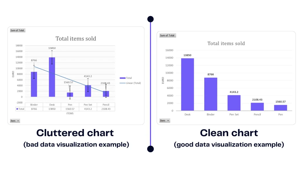
Appropriate chart selection
Incorrect use of charts can distort data interpretation. Selecting appropriate charts, such as bar and line graphs, avoids unnecessary distortions, improving clarity.
Contextualization of information
Lack of context hinders data understanding. Including relevant contextual information helps users interpret the data correctly, adding meaning and establishing meaningful connections between the data and the environment in which it was generated.
Adaptation to changes in user needs
A static dashboard can become obsolete with changes in user needs. Maintaining flexibility to adjust the design as requirements and goals evolve is essential.
User feedback
Ignoring user opinions and suggestions can result in overlooked improvements. Establishing a process to collect and evaluate user feedback is key to continuous improvements and maintaining the relevance of the dashboard.
If used effectively, dashboards are a powerful tool, forming the core of many companies' data strategies. An effective dashboard helps users make data-driven decisions, understand their data, and track crucial metrics for their domain.
In conclusion, it is worth noting that these errors transcend specific tools used, such as PowerBI, Tableau, Apache Superset, Looker, or any other. The effectiveness of a dashboard lies in fundamental design decisions and a precise understanding of user needs, elements independent of the tool used to build them.